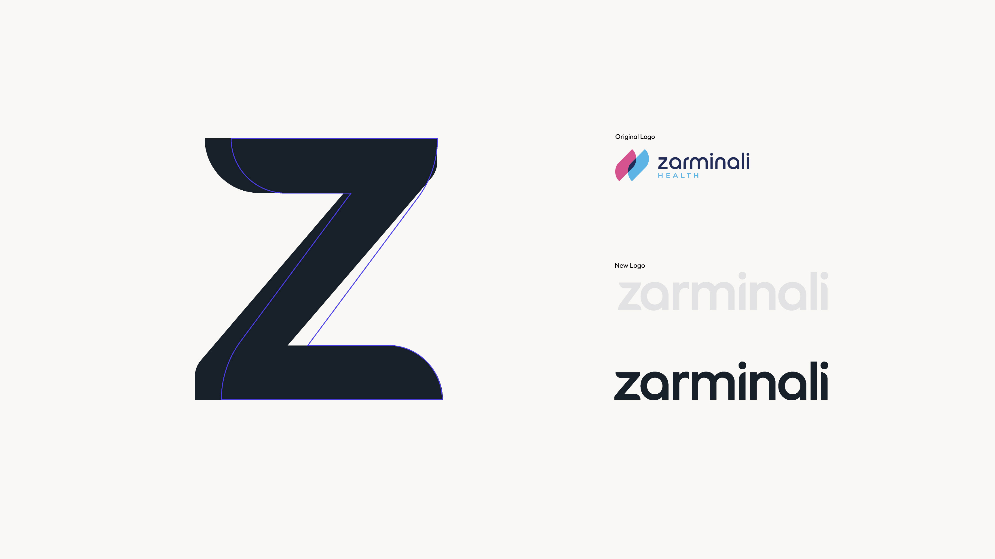
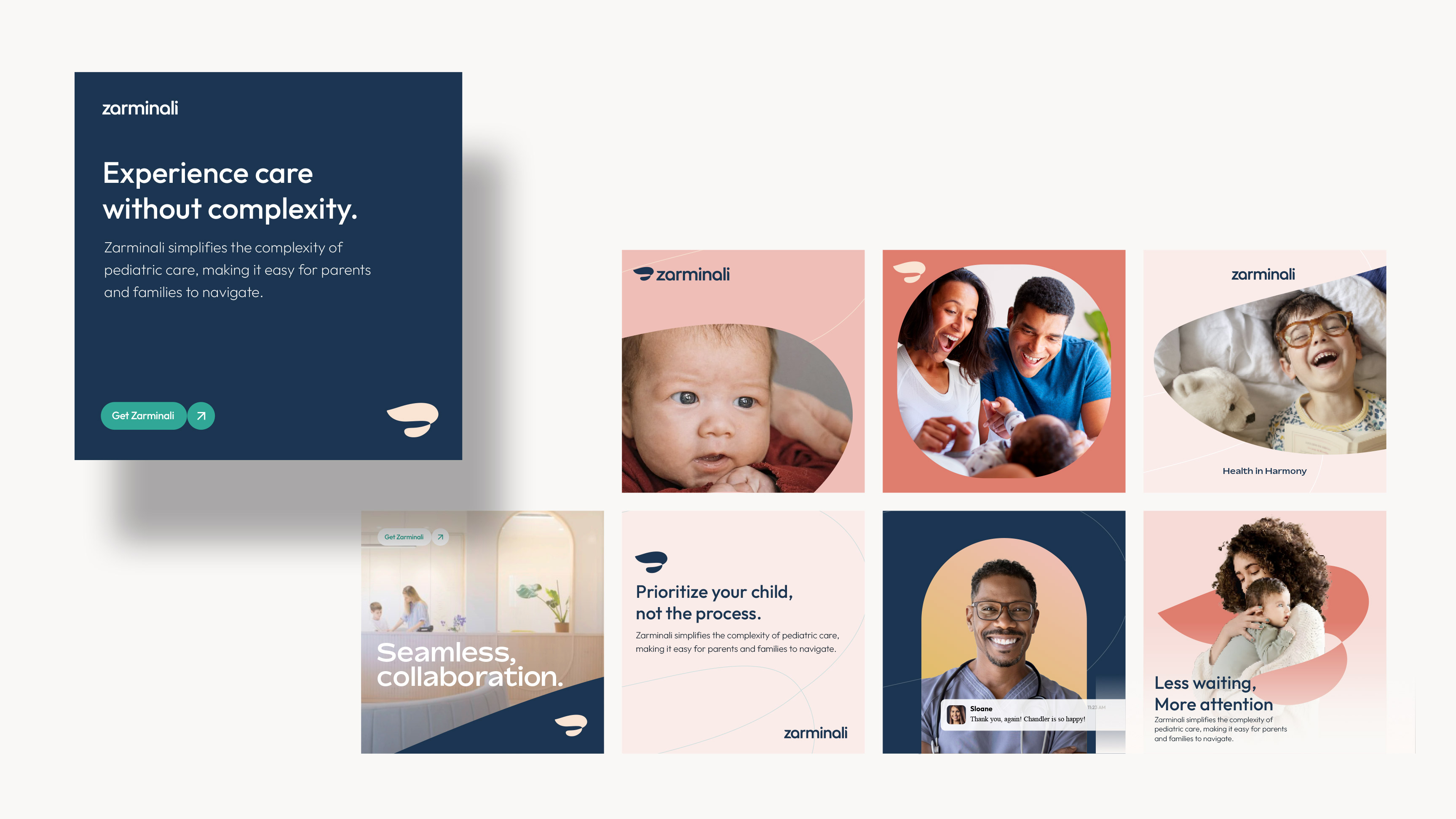
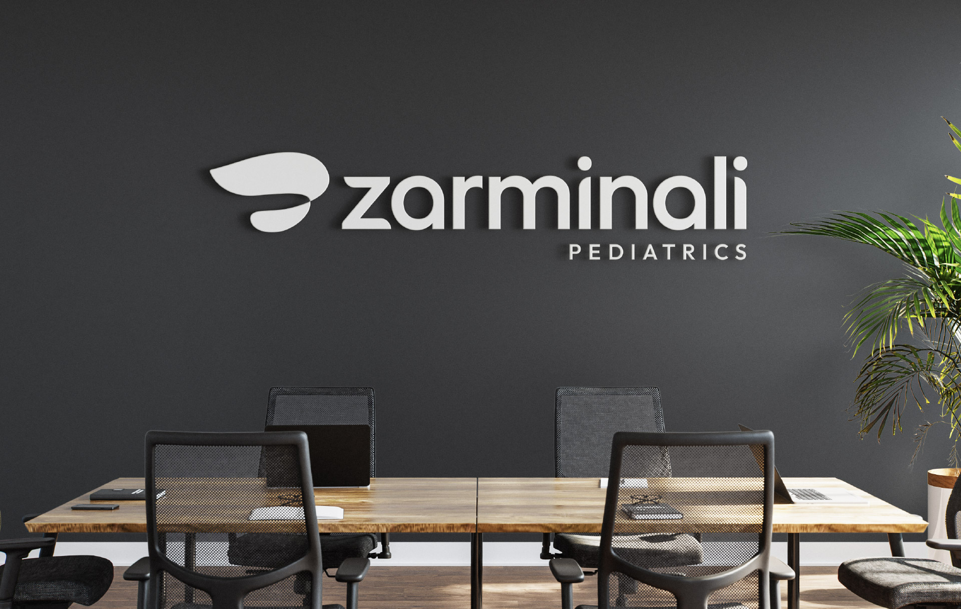
A few months ago, I had the opportunity to collaborate once again with the talented team at Ten Adams on the rebrand of a national pediatric care company, Zarminali. The existing logo lacked distinction and didn’t effectively communicate the heart of the organization. Our goal was to create a mark that not only stood out but also told a meaningful story while overcoming the challenge of being a difficult name to pronounce. The final design is rooted in an organic, flowing structure—an unbroken infinity loop that reflects the seamless connection between families and care providers. It symbolizes the nurturing bond between parent and child, while also representing continuity in care. The result is a mark that feels both bold and gentle—unique in shape, yet familiar and inviting. It conveys warmth, trust, and a deep sense of protection.